Hieronder staat een uitleg van de informatie en knoppen die er op deze pagina te vinden zijn en wat deze betekenen:
Opmerkingen tonen: de instellingen kunnen bij het invoeren van hun bezoekcijfers een opmerking toevoegen (vb gesloten ivm renovatie). Door op deze knop te klikken worden deze opmerkingen zichtbaar.
Print: door op deze knop te klikken, kan alle informatie uit het witte vlak (muv de grafiek) worden geprint
Mail pagina: door op deze knop te klikken, opent het door u gekozen mailprogramma en zal een link naar de pagina waar u nu op staat gecreëerd worden, die vervolgens verstuurd kan worden.
Export: door op deze knop te klikken kan een export naar CSV, PDF of Excel van de data zoals weergegeven op de pagina gecreëerd worden.
3 statistische blokken: Deze 3 blokken geven de volgende informatie weer. De meest linker geeft de maand met het laagste absolute maandtotaal bezoekcijfers in deze sector weer. De middelste geeft de maand met het hoogste absolute maandtotaal bezoekcijfers in deze sector weer. De meest rechter geeft de procentuele afwijking (na correcties)* weer van het gehele jaar tot de meest recente gepubliceerde maand versus dezelfde periode in het vergelijkingsjaar.
Vergelijkingsmodus: door dit schuifje om te zetten worden de waardes in de grafiek en de tabel 'na correcties'* getoond.
Top 10 grafiek: Deze optie is alleen beschikbaar indien de partners de individuele maandgegevens met elkaar delen. Door dit schuifje om te zetten wordt de top 10 partners, op basis van absolute waardes in de selectie in een kolomgrafiek getoond. Hierbij wordt een vergelijking gemaakt ten opzichte van het voorgaande jaar.
Tevens worden alle waardes in de tabel op basis van bezoekaantallen van groot naar klein gerangschikt, ipv op alfabetische volgorde zoals gewoonlijk.
Pinnen:
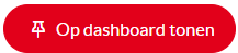
Met deze knop is het mogelijk om een vergelijking die u in de module hebt gecreëerd te pinnen en op te slaan als een grafiek op de dashboardpagina. Klik op het pin-icoontje. Pas, indien gewenst, de titel van de pin aan en klik op opslaan. De pin zal nu op de persoonlijke dashboardpagina geplaatst worden.
Weergave knop: Hier kunnen 2 onderdelen in de grafiek aan/uit worden gezet:
1. Weergegevens: deze kunnen als een 'overlay' over de grafiek aan worden gezet. Hierdoor worden extra gegevens met betrekking tot zonuren, gemiddelde temperatuur en neerslag in de grafiek erbij geplot. Deze data worden dmv een api-koppeling dagelijks ingeladen. (deze optie is niet bij elke module geactiveerd).
2. Weergave secundaire as: Indien er een groot verschil is tussen de data van 2 jaren of 2 sectoren kan er gekozen worden om een secundaire as weer te geven. Dit kan hier automatisch of handmatig worden gedaan.
Vergelijkingsopties: Hier bestaat de mogelijkheid tot toevoegen van een extra jaar / regio / subregio / sector of deelnemer selectie in de vergelijking. Dit tot een maximum van vier.
Rode driehoekjes: de instellingen kunnen bij het invoeren van hun bezoekcijfers een opmerking toevoegen (vb gesloten ivm renovatie). Indien de instellingen hun individuele maandcijfers met elkaar delen, is te zien welke instelling een opmerking heeft geplaatst doordat er dan een rood driehoekje bij het bezoekaantal staat. Door op dit driehoekje te klikken, wordt de opmerking zichtbaar. (zie ook 'opmerkingen tonen')
Leeg vakje: Indien de instellingen hun individuele maandcijfers met elkaar delen, is er soms, in plaats van een bezoekaantal, een leeg vakje in een maand te zien, met een rood driehoekje met een opmerking. Deze instelling is gedurende deze maand gesloten geweest en heeft geen bezoekers ontvangen. Er staat dan geen '0' vermeld, want als dit er zou staan, zou de instelling gedurende de gehele maand open zijn geweest, maar zouden er geen bezoekers zijn ontvangen.
Totaal: Dit is het absolute bezoekaantal per maand, kwartaal of per jaar (afhankelijk van de selectie die er is gemaakt)
Aantal deelnemende musea: Dit is het aantal musea die in de betreffende maand hun bezoekaantallen heeft ingevoerd.
Gemiddeld aantal bezoeken: Dit is het gemiddeld aantal bezoeken per museum, berekend als volgt: totaal / aantal deelnemende musea
Afwijking tov gemiddelde van vergelijkingsjaar: Dit is de absolute afwijking van het gemiddelde bezoekaantal per museum ten opzichte van het vergelijkingsjaar. Dit wordt als volgt berekend: het 'gemiddeld aantal bezoeken van dit jaar' minus 'het gemiddeld aantal bezoeken van het vergelijkingsjaar'.
Procentuele afwijking: Dit is de procentuele afwijking van het gemiddeld bezoekaantal per museum ten opzichte van het vergelijkingsjaar. Dit wordt als volgt berekend: (gemiddeld aantal bezoeken huidig jaar - gemiddeld aantal bezoeken vergelijkingsjaar)/ gemiddeld aantal bezoeken vergelijkingsjaar x 100%
Procentuele afwijking (na correcties)*: Hierbij wordt dezelfde berekening uitgevoerd als bij de procentuele afwijking, maar worden er 'correcties' uitgevoerd. Bij een correctie wordt een instelling die in één van beide vergelijkingsjaren gesloten was, ook in het andere jaar op gesloten gezet om de vergelijking gelijk te trekken.
Weer gemiddelde temperatuur: Indien deze optie bij deze module is geactiveerd, wordt deze data dmv een api-koppeling dagelijks ingeladen en geeft de gemiddelde temperatuur van de maand weer voor deze stad/regio in graden Celcius.
Weer Neerslag: Indien deze optie bij deze module is geactiveerd, wordt deze data dmv een api-koppeling dagelijks ingeladen en geeft de totale neerslag van deze maand weer voor deze stad/regio in aantal mm's.
Weer Zonuren: Indien deze optie bij deze module is geactiveerd, wordt deze data dmv een api-koppeling dagelijks ingeladen en geeft de totale aantal uren zon van deze maand weer voor deze stad/regio.